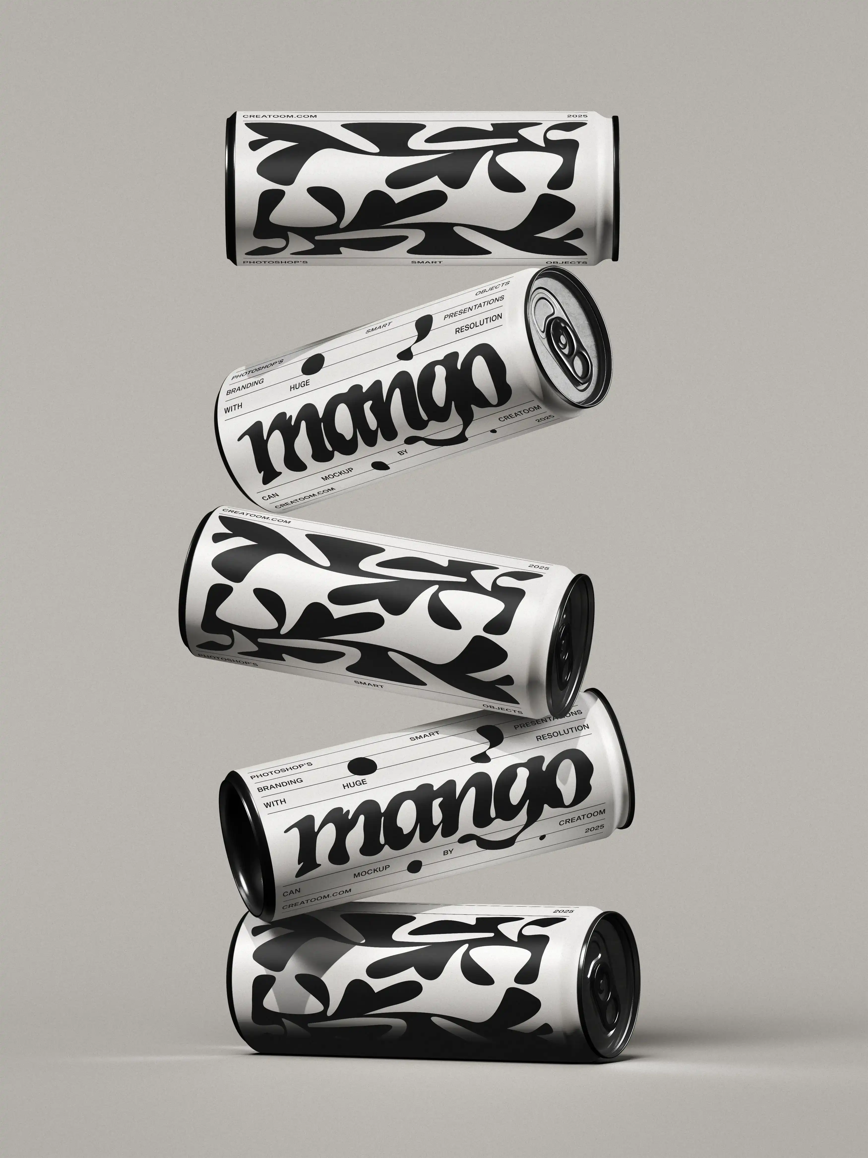
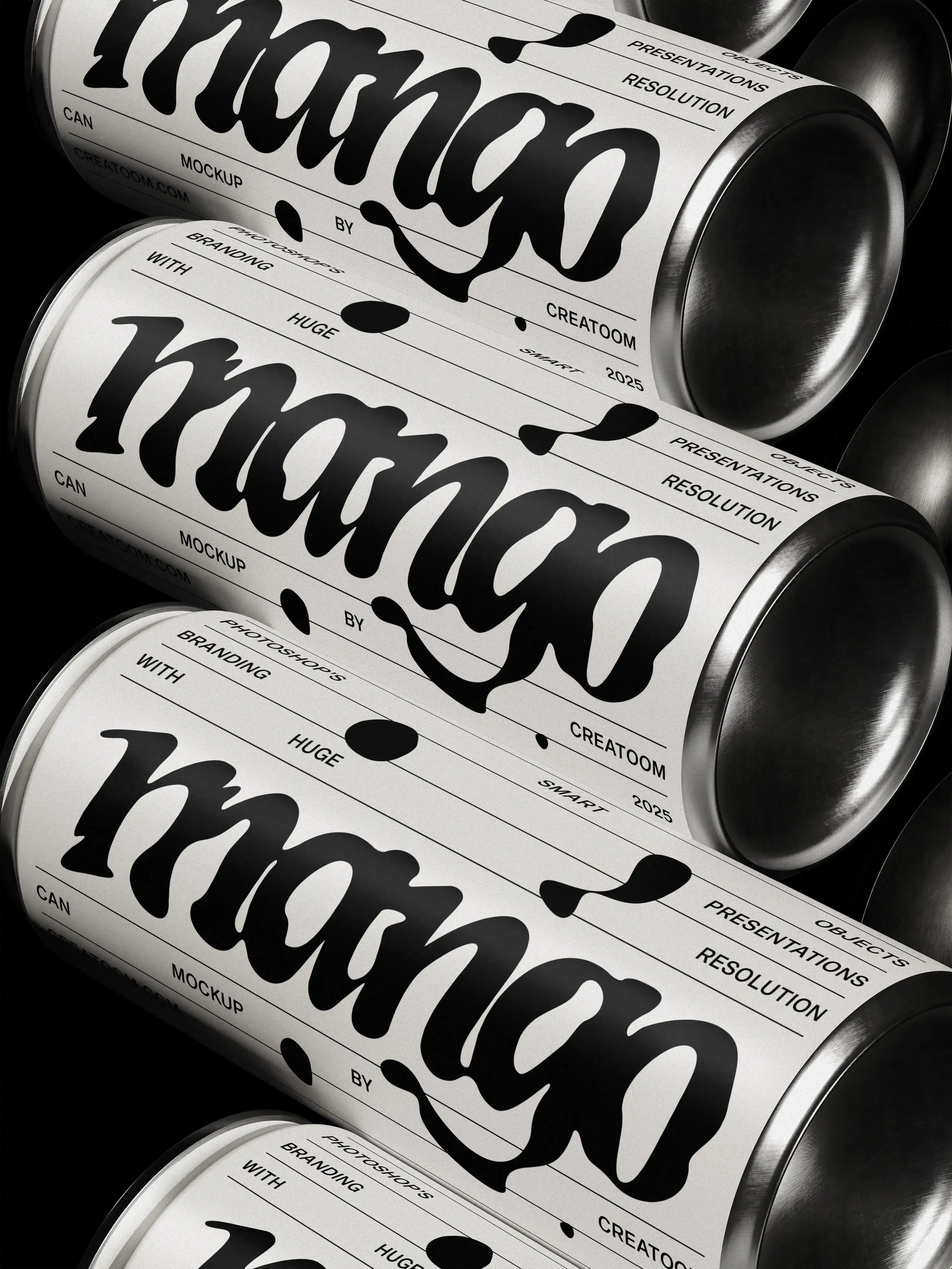
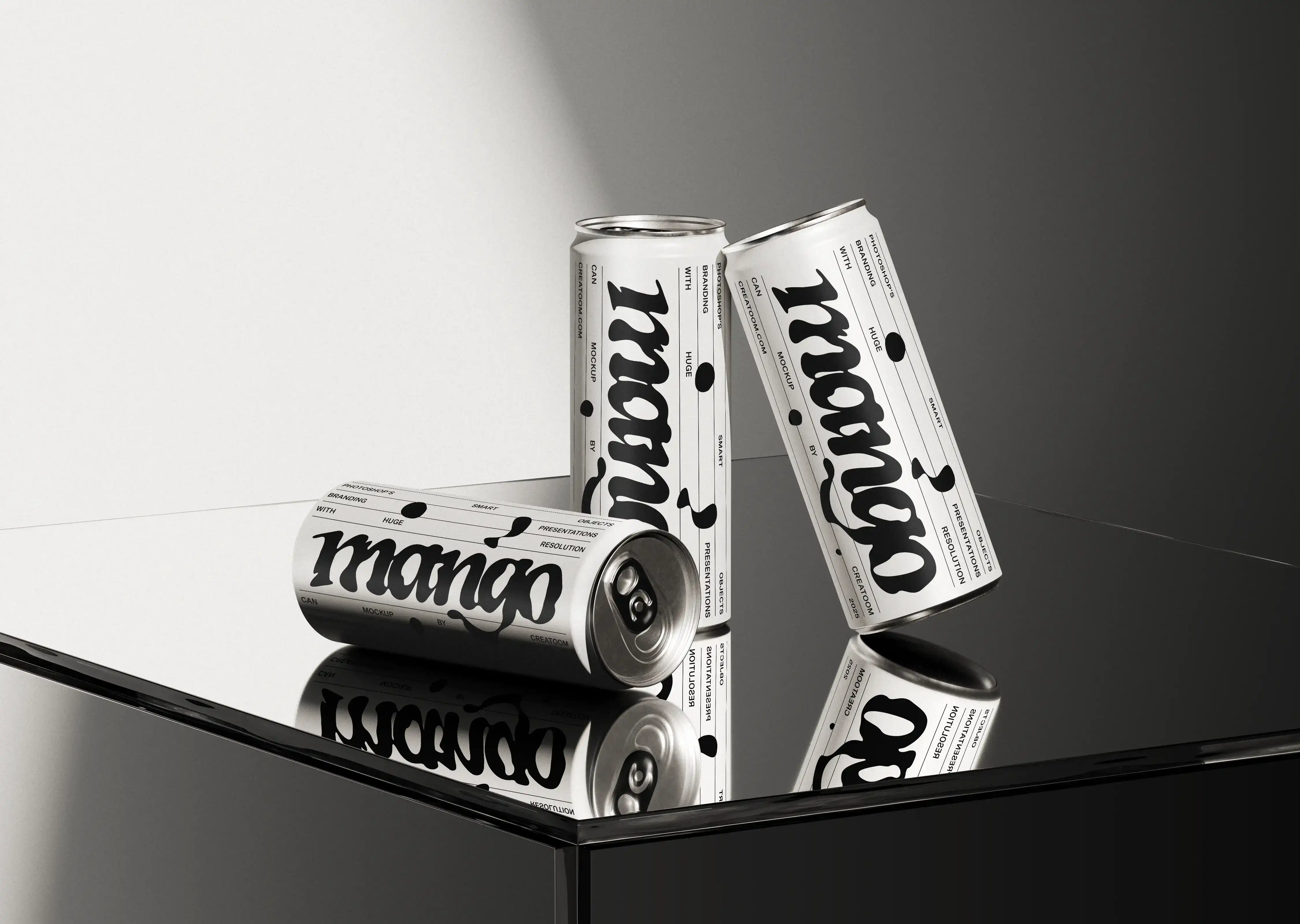
The identity relies on bold, fluid typography paired with structured layout elements. Graphic patterns and type treatments are used to create variation while staying within a tightly controlled system. This allows the packaging to feel expressive without losing consistency.
Special attention was given to how the design performs on curved surfaces, how typography wraps around the can, and how multiple units read together when displayed. The contrast between organic letterforms and precise layout rules creates a balance between playfulness and clarity.