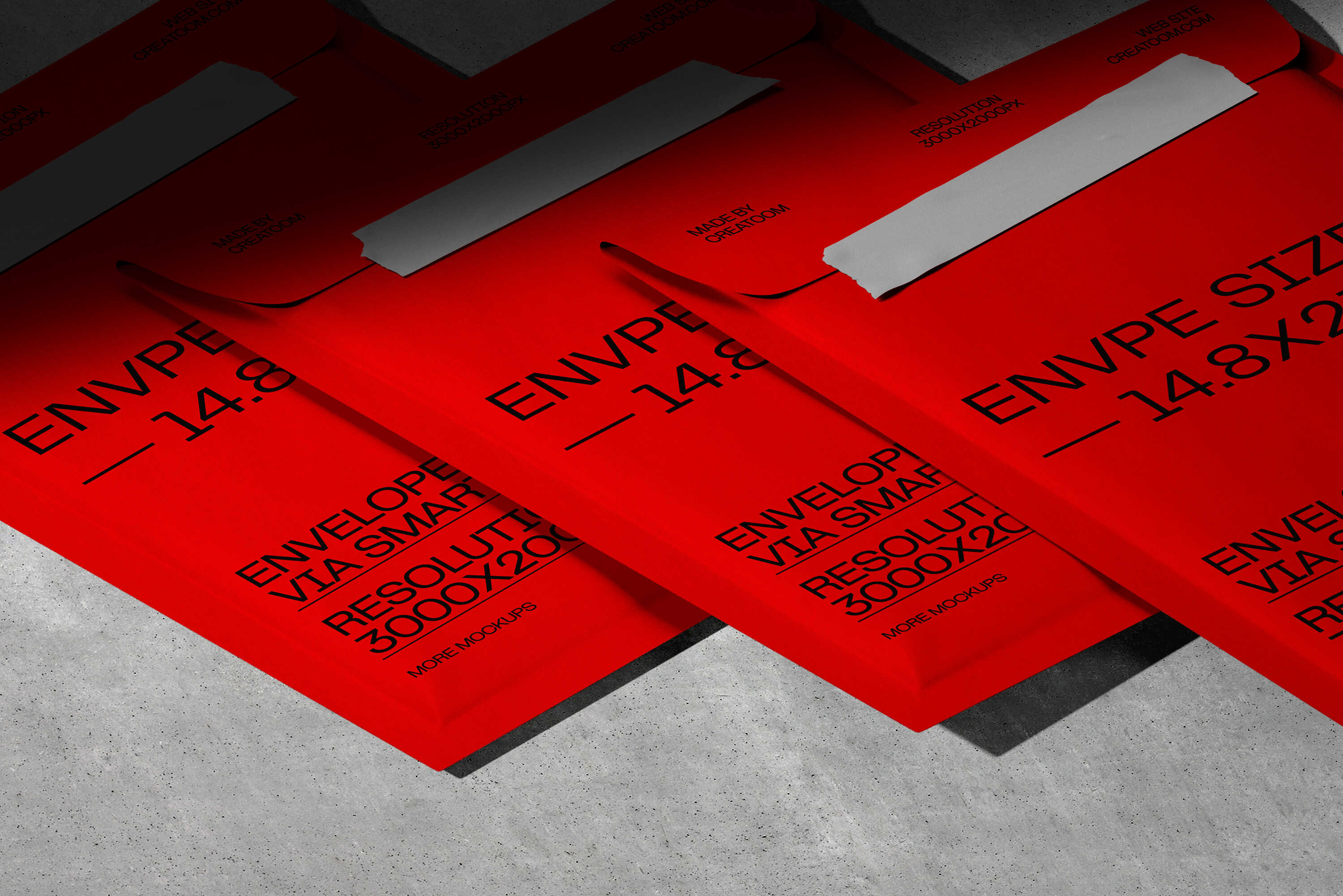
This project focuses on building a visual identity using printed tape as a core branding element. Instead of treating tape as a secondary detail, it becomes the main carrier of typography, messaging, and graphic rhythm.
“Simple idea, strong execution. The tape system worked across every surface we tested.”
Eric Grant
Founder
The system relies on bold type, limited color usage, and repeated patterns to create impact across different materials and surfaces. Tape is applied across packaging, envelopes, boxes, and flat surfaces, allowing the identity to scale naturally while remaining consistent.
By working with repetition and constraints, the branding stays recognizable even when partially visible or cropped. Each application feels intentional, whether used as a functional seal or as a dominant visual element.
The result is a practical and adaptable identity system designed for physical environments, logistics, and packaging driven use cases where clarity and visibility matter.