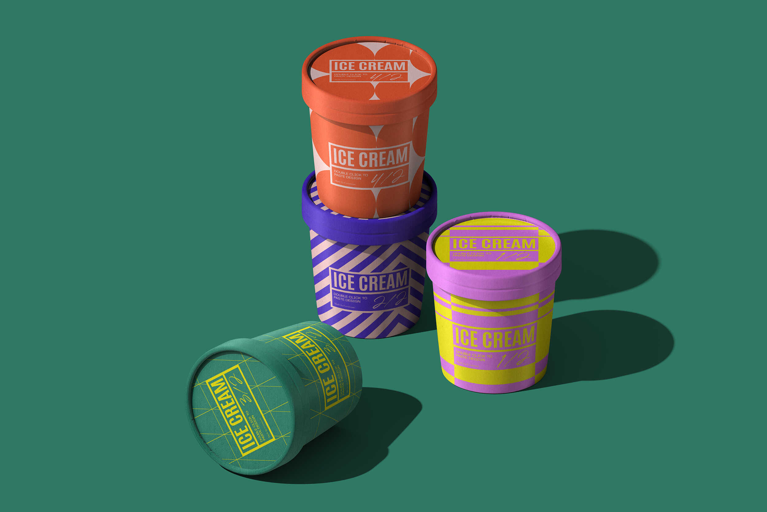
This project covers the visual identity and packaging design for a line of milk based products, spanning multiple formats such as cups, bottles, cartons, and boxed packaging. The goal was to create a system that feels approachable and playful while remaining clear and functional in a retail context.
“The project delivered a clear and flexible packaging system that works across a wide range of product formats. The use of color and pattern made it easy to differentiate products while keeping everything visually connected.
Ella Ross
Marketing Director
The visual language is driven by color coding, simple geometric patterns, and a consistent layout structure. Each product variation uses distinct color combinations to help with quick recognition, while shared graphic elements tie the full range together.
Special attention was given to how the packaging works across different shapes and sizes, ensuring legibility on curved surfaces, clean alignment in multi pack displays, and strong visibility on shelf. The system is designed to scale easily as new flavors or formats are introduced.