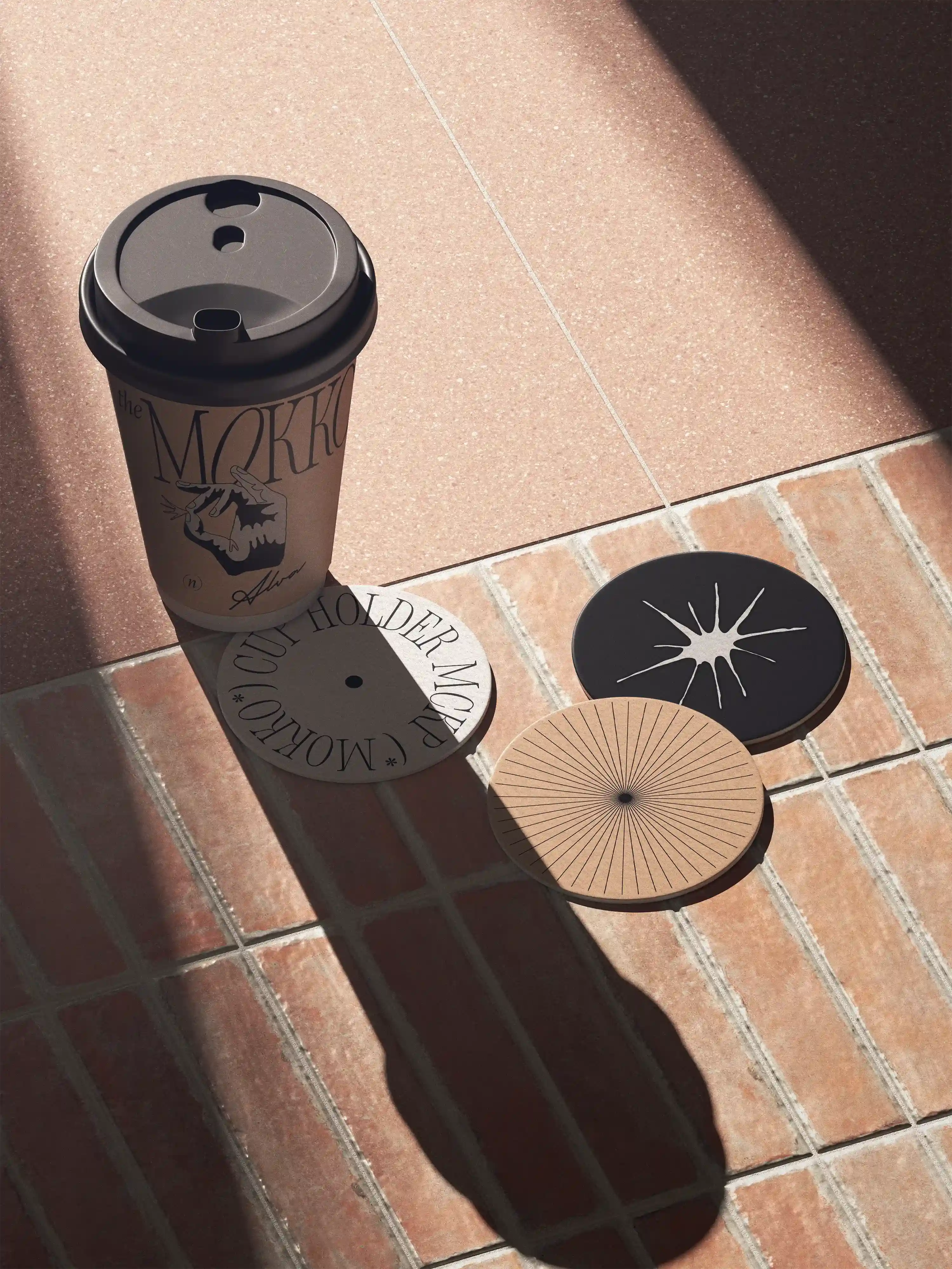
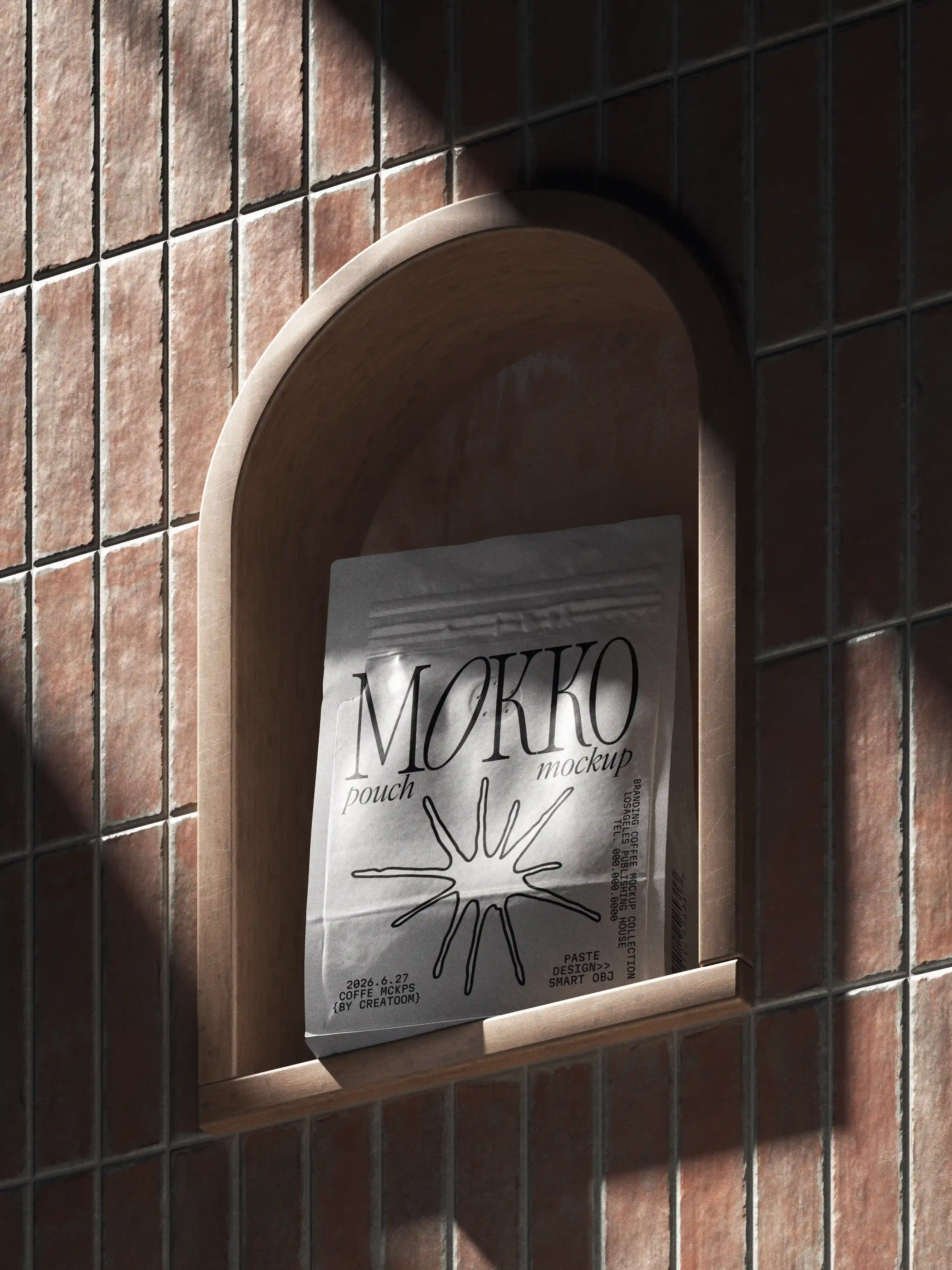
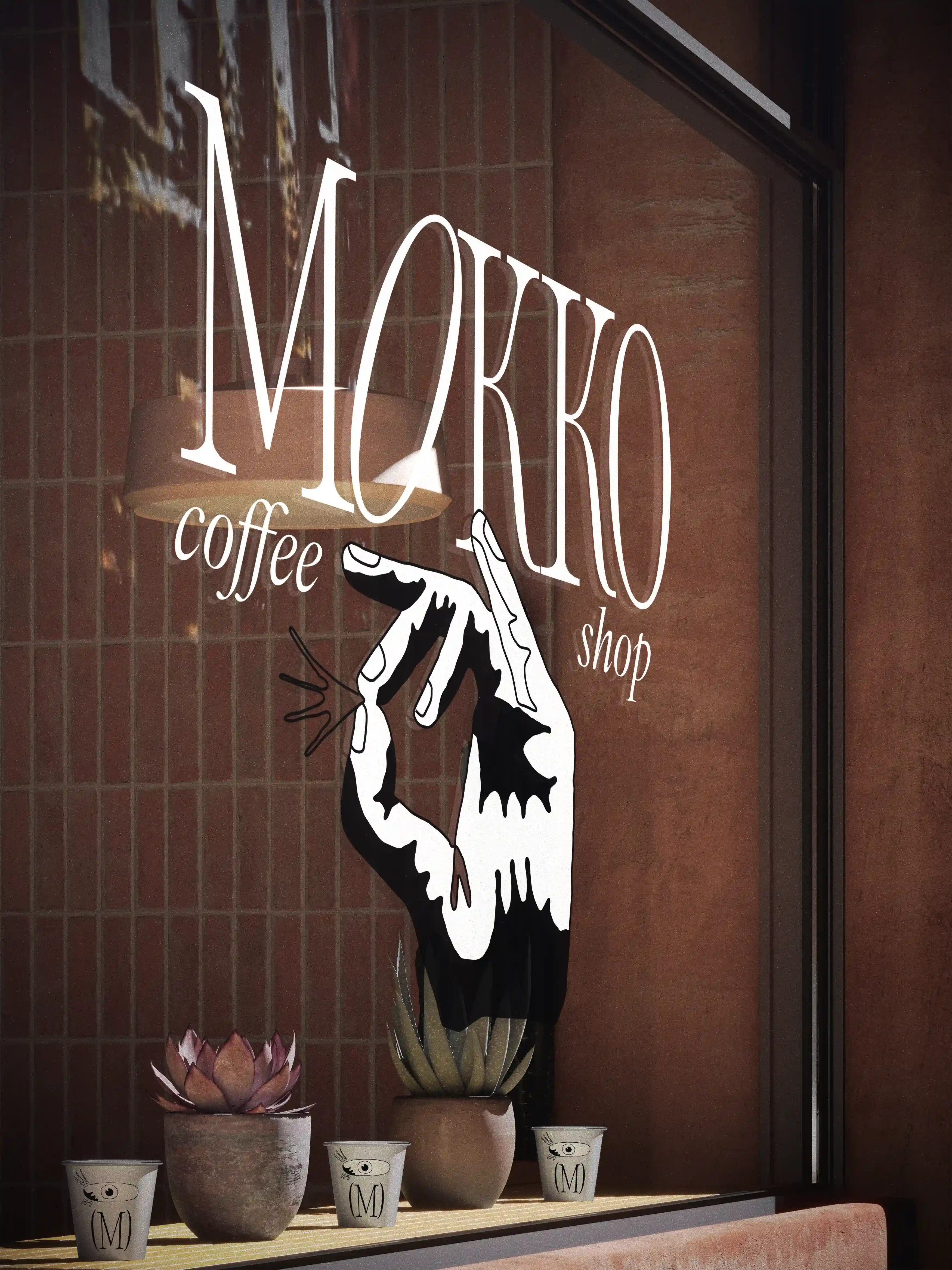
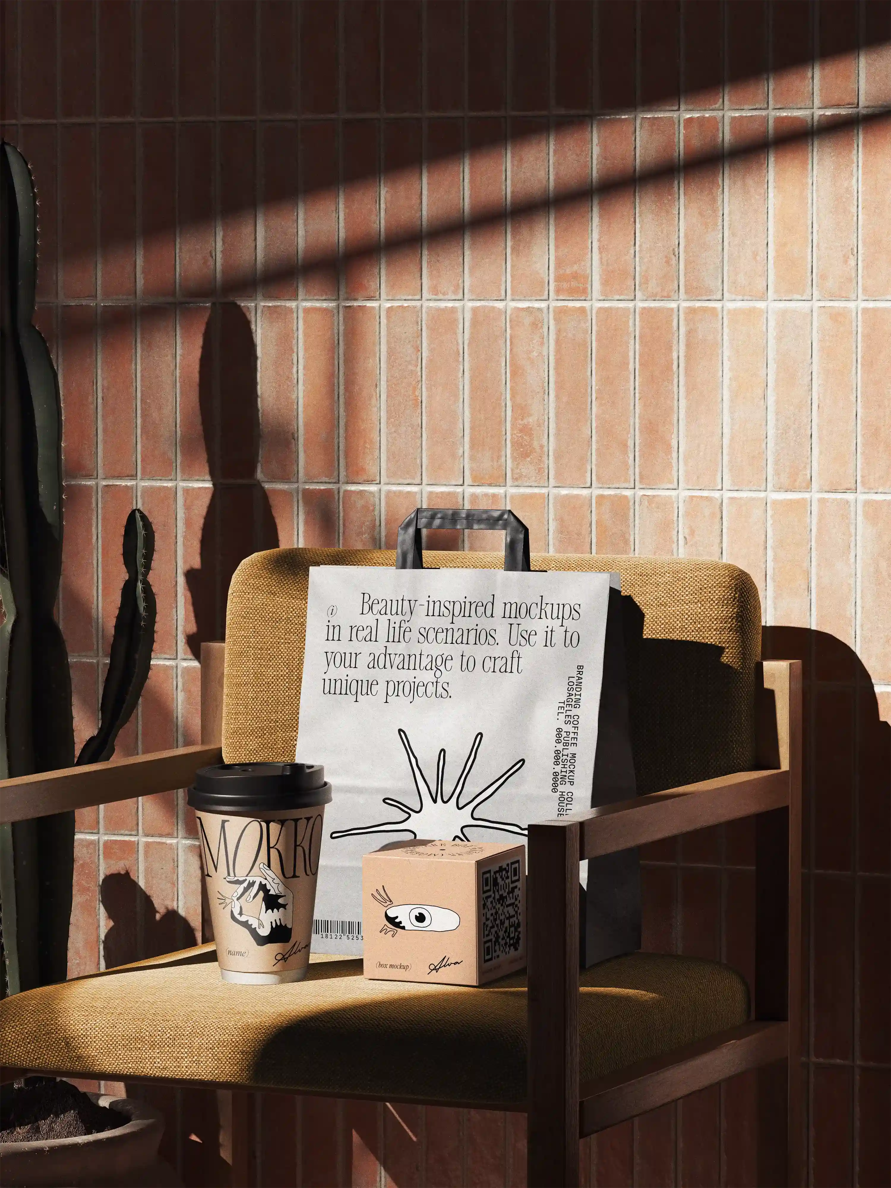
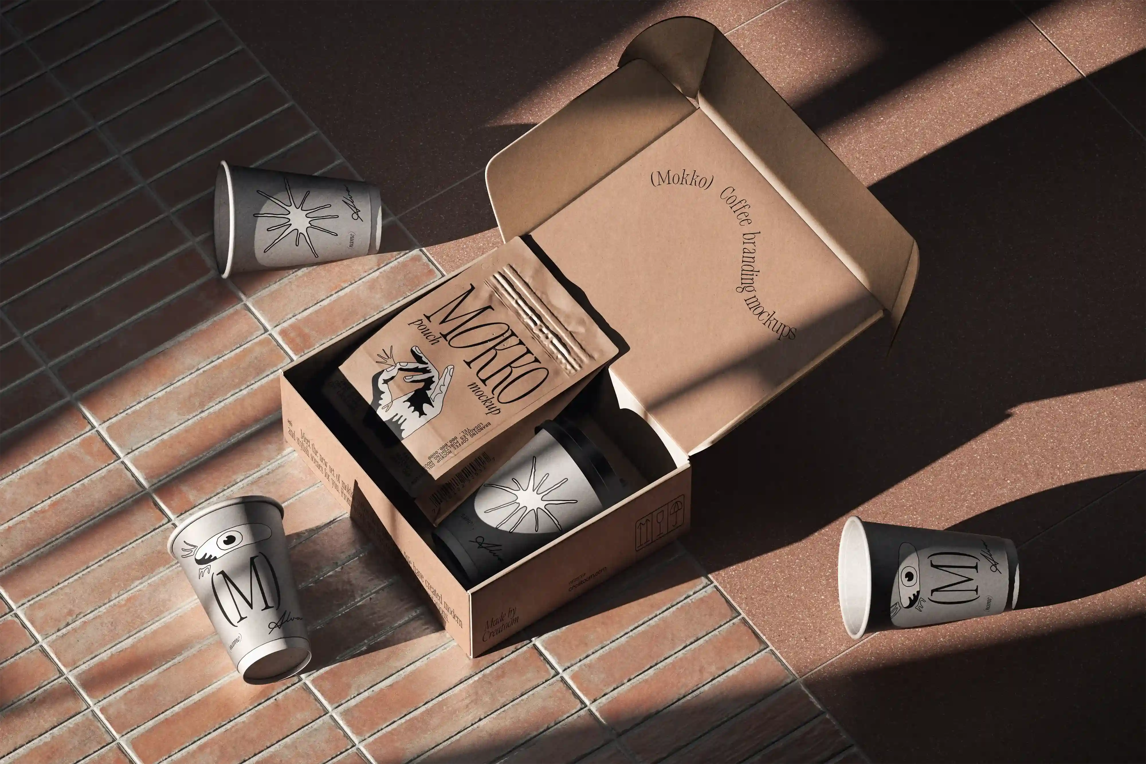
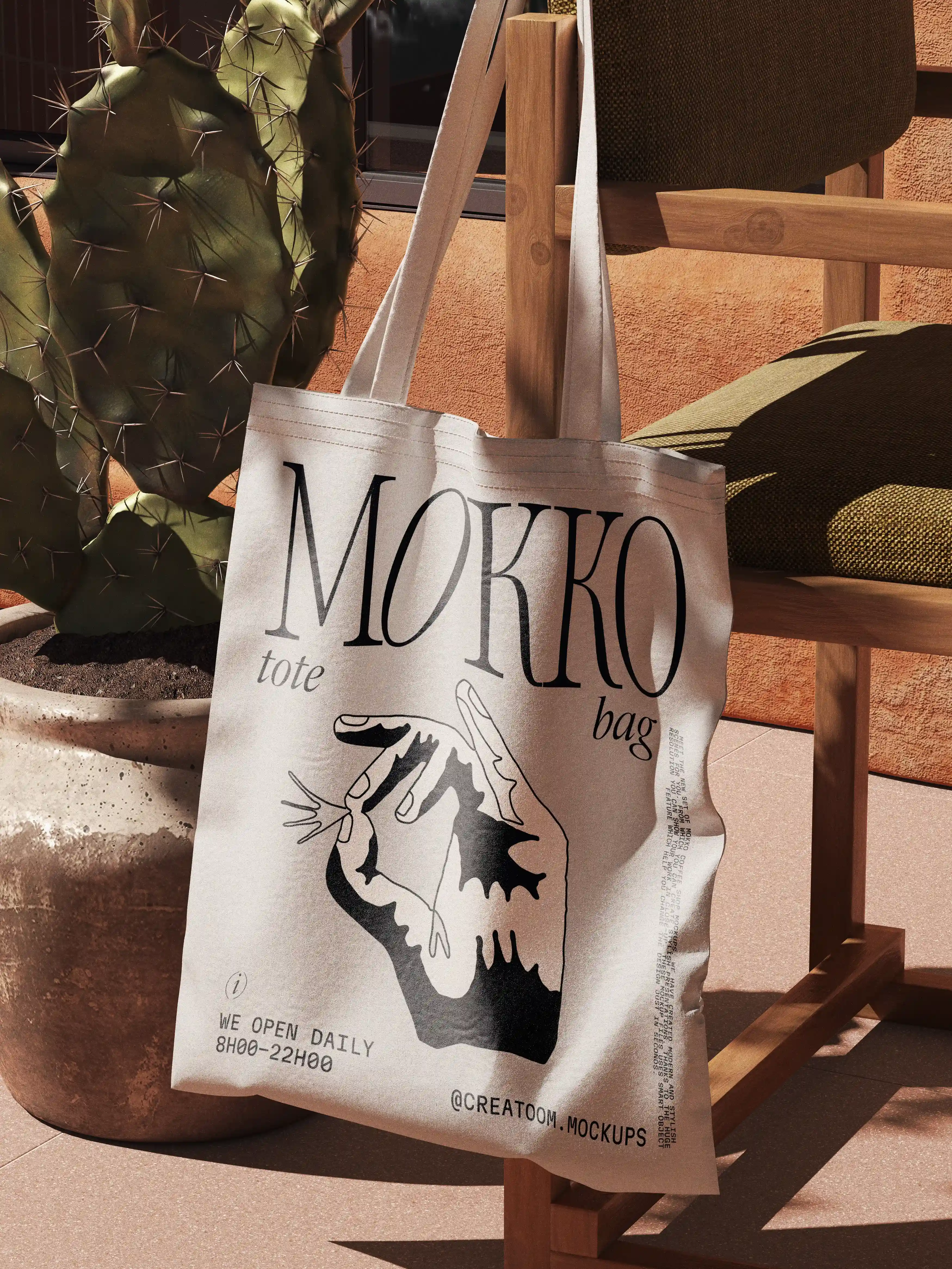
This project covers the branding and print design for a coffee brand, with a focus on physical touchpoints and everyday use. The scope includes packaging design, takeaway cups, paper bags, and supporting printed materials.
The visual system is built around clean typography, subtle graphic elements, and a restrained color palette. Special attention was given to paper texture, print finishes, and how the brand appears under natural light and real usage conditions.
Rather than treating each asset in isolation, the brand was designed as a cohesive system. Every element follows the same typographic rules and layout logic, allowing the identity to scale naturally across different formats while maintaining consistency and clarity.
The result is a practical, production ready branding system that feels understated, durable, and suited for daily use in café and retail environments.